Primary colors are some of the core colors of the color wheel, and they form the basis of many other colors. Of these primary colors, red and yellow would certainly have to be the warmest of them all!
You will know of these colors, but do you know the answer to what color does red and yellow make when mixed?
Even if you do, you may be surprised by how many variations and uses these colors have!
This guide is all about what you can expect from mixing these colors as well as some practical tips. So let’s begin and see what you can do with these colors.
How you can mix red and yellow?
As we mentioned in the intro, red and yellow are two primary colors on the color wheel. Mixed together, you will get some form of orange more often than not.
It is a common combination that many people may know of, but there are lots of subtleties and nuances to the mixture.
We will cover some of these subtleties later on in the guide, but first you may be wondering how you can mix red and yellow. That is a good question that has many answers!
When using any kind of art medium, you should stick to one medium and not mix other mediums with it. So, if you’re sticking to acrylic paints then you shouldn’t mix oil paints with them.
That is just one example, but it’s okay because you have so many different mediums at your disposal!
No matter what medium you are working with, you should have some kind of surface that you can practice on.
This is because mixing colors takes a lot of trial and error, and you don’t want this trial and error happening on the final page.
What you practice on is up to you, and it doesn’t really matter what it is.
Red and yellow can be used in many different contexts, and this is true whether they are mixed together or used with one another.
They are similarly warm colors, so there are many contexts where they could be used to close to one another. We will definitely cover some of the ways that you can use them together later on!
For now, try to get your hands on some art supplies to play with. These could be different kinds of paint, pastels, pencil crayons or regular crayons.
That is just a small selection of the kinds of mediums you could use to create some color magic! Now we can look at the question of whether red and yellow are a good color combination.
Are red and yellow a good combination to mix together?
As we mentioned earlier in this guide, red and yellow are very close on the color wheel. They are also both classified as warm colors on the color wheel, and so they go really well together.
We will look at some specific examples of how they can go together later, but they are almost always a good mix. Despite this, you may want to carefully think about the shades that you choose.
When combining two colors like red and yellow, you can often make them work together as a gradient.
This means that by making the shades lighter and lighter that you can work your way from one color to the next.
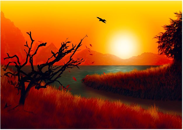
We will show you some examples of this, but the colors of a sunset would be a good example of a usage for a gradient.
So that covers if they are good to use with one another, but what about as a mixture?
As you will soon find out, orange is a color that has many, many uses. So there are many contexts that you can probably find to use it with.
Orange can be a beautiful color that can be bright or muted depending on what you need. It’s a rich color to have in your color arsenal, and we will find out some of the many ways that you can use it later.
For now, let’s have a look at some of the results you can get from the mixture of red and yellow.
What results you can expect?
You may be wondering what will happen when you mix your red and your yellow together. That’s something that you will need to find out for yourself!
We say this because the result can sometimes be surprising and depend on the shades and art mediums you use. For now, why not grab your favorite medium.
As an example, let’s use acrylic paints to illustrate the point. Find your basic red and yellow (every set should have at least one of each) and mix an equal quantity together on the page.
Chances are that you will land up with a fairly neutral orange color. If you have a fancy paint set that has lots of shades of red and yellow, then try to mix other ones.
Maybe mix dark red with dark yellow and then try a light red with a light yellow. Then, try adding a smaller blob of one color to see which one overpowers which.
When playing around, try to take note of the different results you land up with. This is because once you get the hang of it you should be able to better predict the different results.
When you have a specific orange that you need to recreate for a picture or object, we can look into being more deliberate with the color choices.
That is again something we will cover in the final step of the guide. This part is all about being experimental.
Once you have played around with one medium, maybe try another one. See how the colors are so much softer with watercolors or so much richer (and messier) with pastels.
Even if you used similar tones with one medium as you did with another, the medium change may make the colors look different.
This is something else you should try to take note of, as you may need a certain type of color intensity for a certain picture.
Diving right in and playing around with different colors and mediums is the best way to learn.
Just remember that dark and light colors will react in a way that is usually pretty logical. That is something that you can tweak with some degree of control when you start being more careful with the mixes.
For now, let us first look at some of the best uses you can have for red, yellow and orange before we look at how you can make the colors you want.
Best uses for red and yellow mixes
Soon we will investigate how you can mix light and dark colors to achieve the colors you need. But first, let’s look at some of the uses for red and yellow and the colors they can create.
Orange is a color that is not as prominent in nature as some other colors like brown, green or blue. That isn’t to say that it is unheard of to see this color in nature.
For example, there is the fruit that gives the color its name: the orange. That fruit is not the only fruit that has that color, though.
Some synthetic foods have the same color such as cheesy potato chips or some kinds of cheeses. Orange is also a common color for many kinds of plastic objects.
For instance, many cleaning detergent bottles have a bright orange color. This is because it is a bright color that really catches the eye.
This eye-catching quality of the color also makes it popular in advertisements. Some animals like tigers or foxes also have beautiful orange fur.
It is also seen in bird feathers and flower petals. Some people even have natural orange hair that can look really striking!
We mentioned that you will sometimes see this color in the sky at sunset or sunrise. In fact, this is a context where you could use red, yellow and orange all in the same picture.
Something like that would also be a great usage of that gradient we mentioned earlier. For instance, red can blend into orange which then blends into yellow.
That is one example, and it is something that you can learn more about from experimenting. It also depends on the subjects that you are painting.
We have given you a fine selection of things that have these colors, but we are sure you can think of many other uses for these colors!
We would love to see some of the different things you can find to use these colors on. Finally, let’s look at how you can influence the way the colors look for your picture.

Lighter and darker red and yellow mixes
When you sit down to create your artwork, you may have an idea in mind. For this example, let’s say that you are painting an orange on a plate.
The first thing you want to do is look closely at the colors of the orange. Even though it is one color, you will notice many different tones.
For example, the orange will be at its lightest where the light hits it. Then, it will be the darkest wherever shadow is falling on it.
On your spare piece of paper or canvas, try and experiment to find the different tones of orange you will need. If it’s too light, you could add a few different colors to fix the issue.
The easiest would be to add some black paint. That is not the only option for making it darker, however.
Depending on the tone of the colors, you could instead add a dark blue or maybe a rich maroon color. These can make the colors darker while keeping to the subtler tones of the colors.
If the colors are too dark, then you will need to make them lighter. The concept is the same, but the colors will be different.
White can be used to make it lighter, but you could also use some lighter yellows and reds to influence it. This is why it is important to experiment on a separate surface.
When you are adding colors to change the brightness, remember that less is more. It can be easy to get carried away and put a giant blob of black paint into your blob of orange paint.
This could make it way too dark and then you have even more of a problem on your hands! Try to add small spots of the additional colors until you’re happy with how it looks.
It’s a combination of perseverance, practice and a little bit of logic. Add some close observation to the mix and you have the recipe for beautiful colors!
Don’t be afraid to use colors other than black and white for this purpose, especially if they will make the tones closer to the real colors of whatever you’re painting.
With all of these tips, you will have everything you need to create some amazing artwork!
In summary
That brings us to the end of this guide, and we have answered the question of what color does red and yellow make when mixed. We hope that this was a fun and helpful guide for your art journey!
Remember to practice with your colors and mediums and try to be observant as you identify the colors you need. It’s never a race, and you can take all the time you need to make your colors.
Now you have everything you need to create some bright and warm pictures that will catch the eye of anyone who goes near it! We can’t wait to see what you create.


