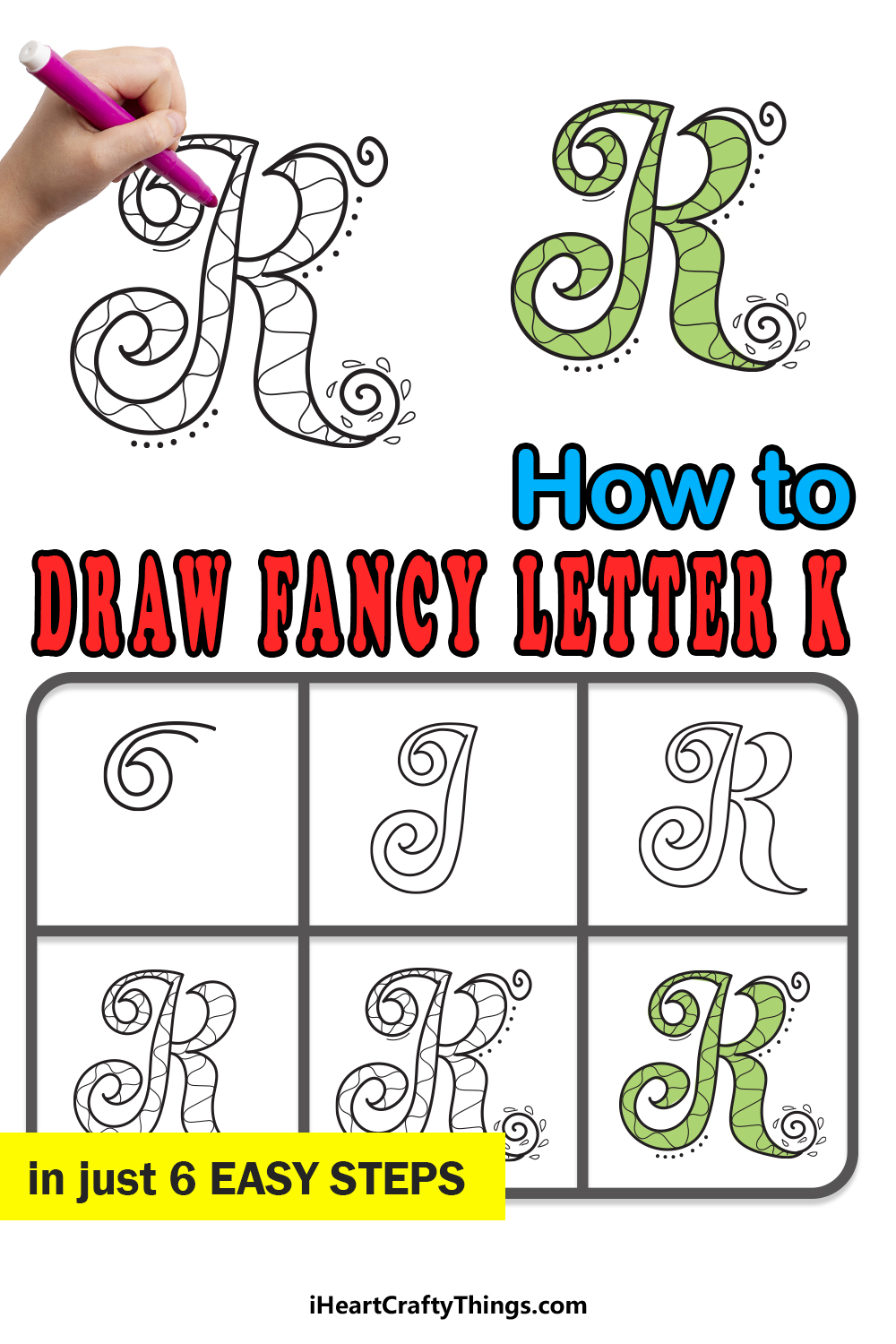
The letter K is one of the strongest letters in the alphabet. It is the eleventh letter, and it has a distinctive design and a strong sound.
It’s one of the trickiest letters to learn to write, and it doesn’t get any easier when you’re learning how to draw it in a unique way.
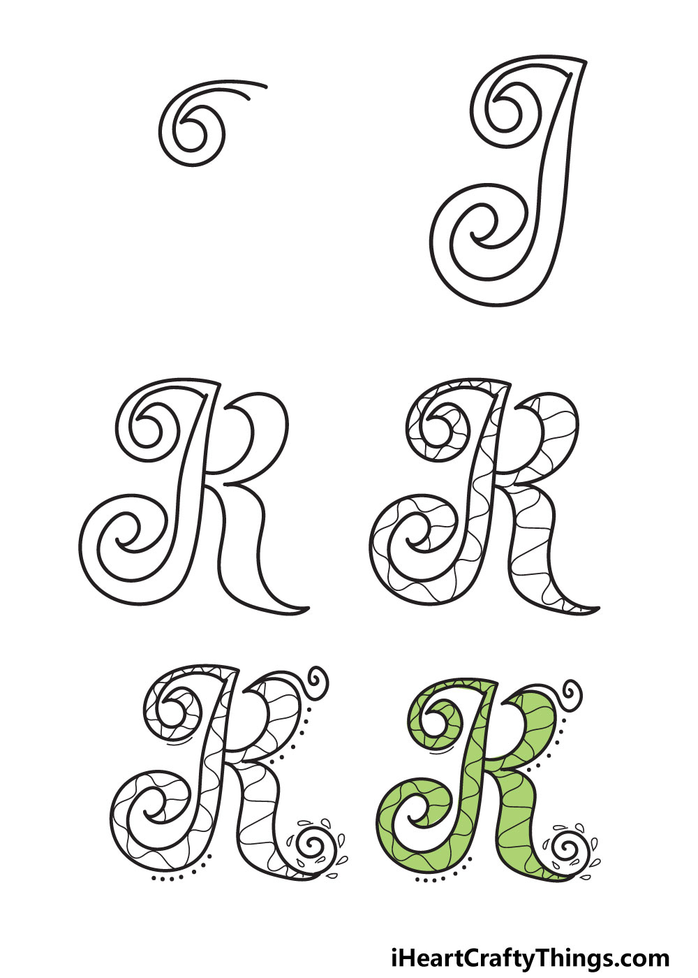
Luckily, that’s why we have this guide to show you how to draw a fancy letter K! We have a really cool design for you to learn, broken down into 6 easy steps.
We will show you how to plan out this drawing, show you step-by-step how to draw it and then give you some ideas on how to color and decorate it.
At the end, there will also be some bonus ideas on how you can add some more of your own ideas to the drawing, so there is a lot of fun to be had!
Let’s Get Started
STEP 1:
For this design, we will be using the capital version of the letter K. you’ll notice the design is quite curved and stylized to get that fancy effect we’re going for.
As we mentioned earlier, this letter can be hard to write. This could make things a bit difficult, so we will plan out the drawing first.
To do this, first find the lightest pencil you can. If you only have a regular pencil, then press slightly on the page so that the lines aren’t too dark.
Then, you can draw out a large letter K. You can base it on the letter K in this sentence, as for now it doesn’t have to look like the final drawing.
It’s just to guide you and to ensure that it is shaped the way it’s supposed to be. Once you have it written out, we will draw the first details.
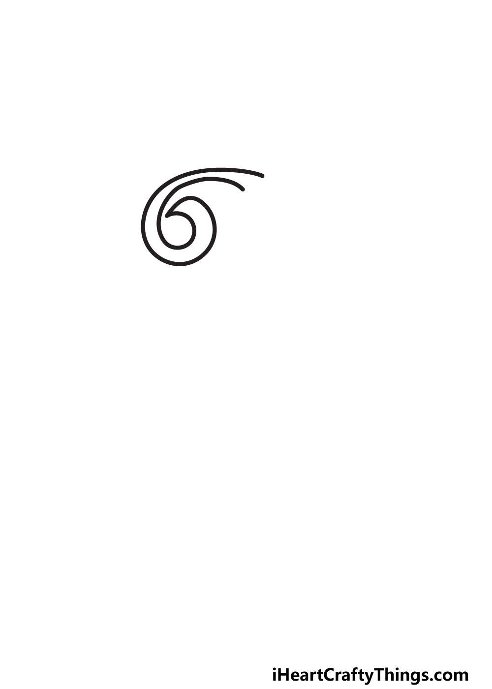
On the left side of the letter, you will see that we will be drawing some spiral shapes. These are to make the letter look fancy and elegant, and we will draw the first one now.
Start with a curved line that rounds off to the left. It will then twist down and around, curling in as we show in the reference image.
Once this first spiral is drawn, we can move on to the second step of the guide.
STEP 2:
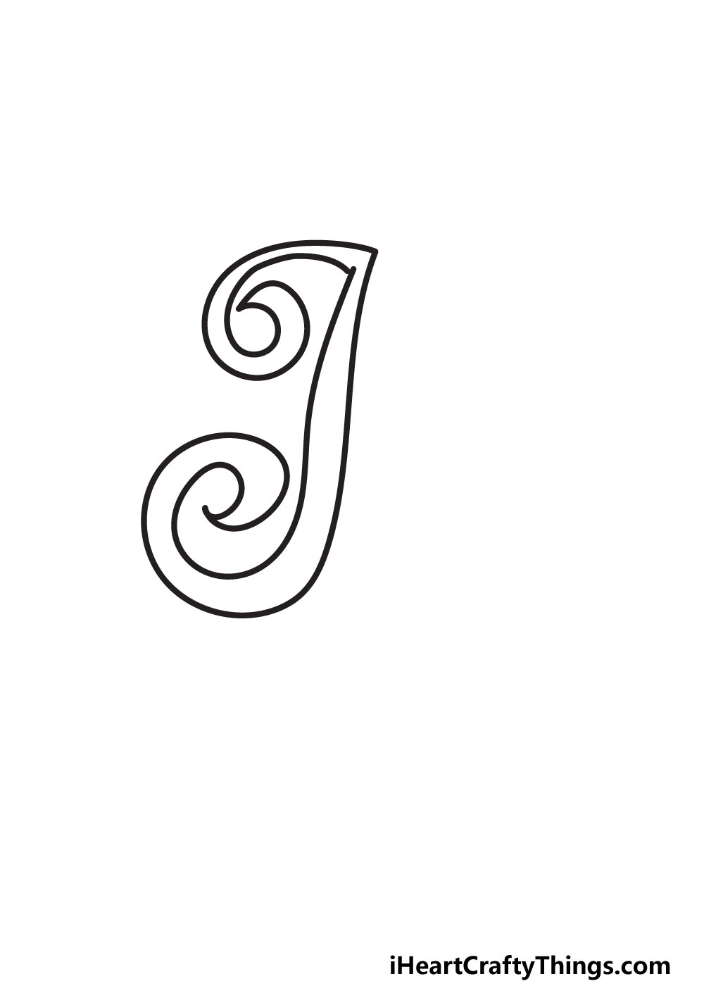
For this design, you will see that we are separating the letter K into two halves. Next, we will draw the left side of the letter.
To do this, we will be starting by drawing some lines down from the spiral shape from step one. These lines will be vertical with a very slight waviness to them.
The closer you get to the base of this shape, the more this shape will gradually curl over to the left. It will then arch up in another spiral.
This spiral will be larger than the first and will be circling in the opposite direction to that one. It might not seem much like a letter K now, but it will all come together in the next step.
Once this side is drawn, we will then add the second half of the letter K in the next step.
STEP 3:
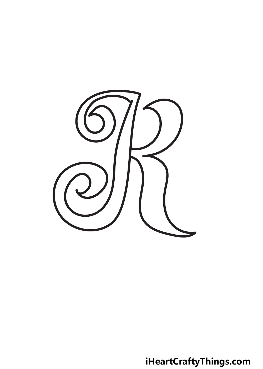
Now, we will be drawing the right hand side of this fancy letter K. This other half will look very different to the first one, as there will be no spirals.
For this half, we will be drawing two curled, pointy sections. Let’s start with the one on the upper half of the letter.
From around the midway point of the first shape, curl a line up sharply. It should curl so sharply that it almost touches the first shape.
There will be a pointy tip close to the first shape, and then it will curl outwards again in an arch. This line will also stop fairly close to the first shape.
Now, we will draw the pointy lower section of the letter. Continue from where you stopped in the previous step and draw a curved vertical line heading down.
This line will curl out, ending in a pointy tip at the base of the letter. At this pointy tip, bring the line back towards the center of the letter, gradually curling it up.
Eventually, it will meet the first shape, just under where the top of this section started. It’s a lot to do, but if you take it slowly then it shouldn’t be too difficult!
When it’s done, we will then erase any pencil lines before continuing.
STEP 4:
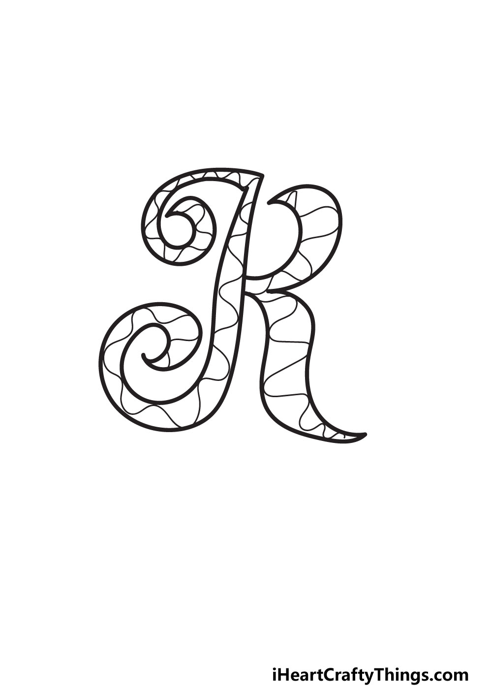
The previous step was quite complex, so now we will slow things down and simplify them a bit. For this part, we will be decorating the interior of the letter.
You will see in our reference image that we did this with some wavy lines all throughout the letter. This is just one way that you could decorate the interior, though!
You could use straighter lines, for instance. This would give the interior more of a rigid look that may work better for some tastes.
You could also fill the interior with color or maybe some small shapes. It’s up to you, so you can choose to do our design or show us one of your own!
When you’re happy with how the interior of the letter is looking, we will then add a few more details around the letter in the next step.
STEP 5:
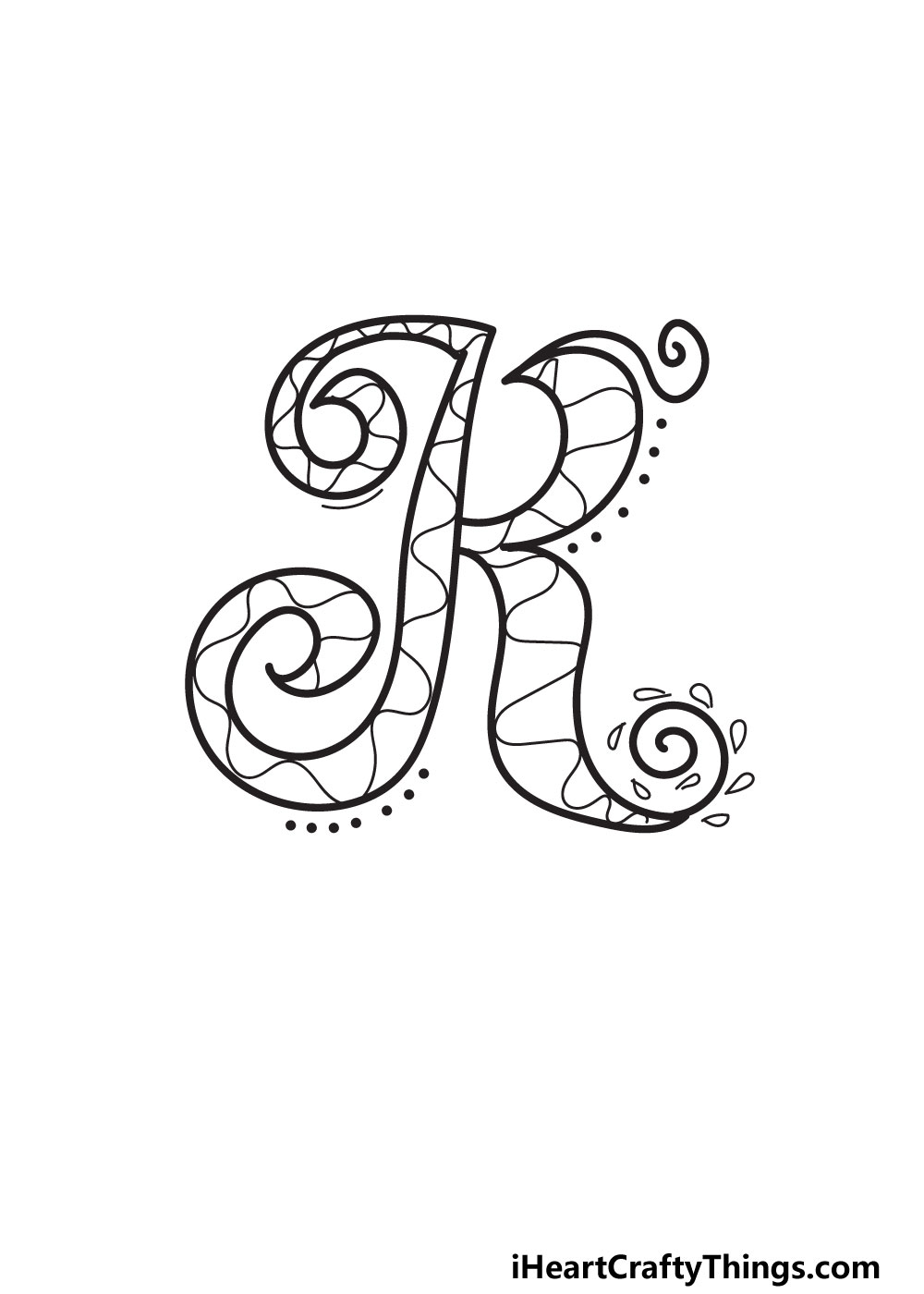
This is another step where we are giving you a suggestion that you can experiment with. We added a few flourishes around the letter to show you some of the details you can add.
For example, we added some spiral lines to some of the tips of the letter. Then, we surrounded one of these spirals with some small teardrop shapes.
We also drew a series of dots around some areas of the letter to create an even more intricate look. In our design, we kept these details quite minimal, but you could add more if you like.
Or, you may want to add some in different places of the letter. There are lots of possibilities, so you can really experiment and see what works best for you.
There is also plenty of free space in the background for you to play with. That could be filled with solid colors, or you could draw some fun shapes and other details.
You can experiment in the meantime, but we will also talk about some themes and ideas you can use for the background after the next step.
Speaking of that step, let’s move on to step 6 and color in your fancy letter K.
STEP 6:
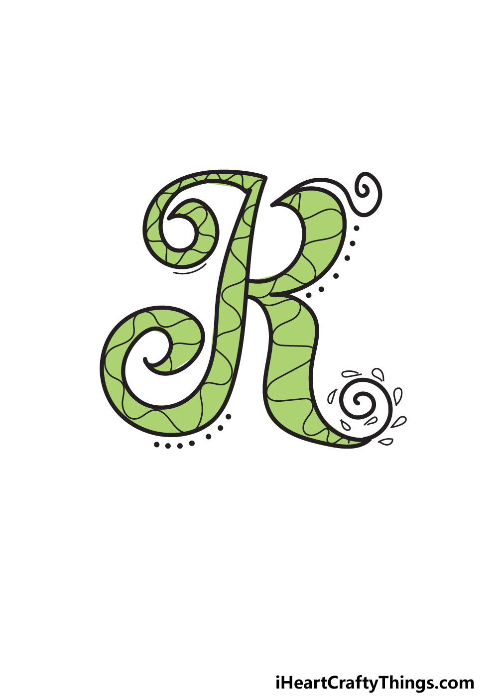
It’s time to get out your coloring sets and favorite mediums as we bring some color to your drawing! Now is your time to really get creative and show off what you can do.
In our reference image, we show you just one way that you can color in your image. We chose a light green color for the letter that gives it a soft, elegant look.
You can use this color for your own one if you like how it looks, but there are many other colors to use instead. It doesn’t have to be just one color, either!
You could fill the design with a wide range of colors and details to really make it pop. By mixing different mediums, you can make certain colors stand out or blend in depending on what you want.
So now you can show off what you want the colors to be for this drawing by getting creative with it!
Remember to color the background and surrounding details as well.
Now, we have a few final ideas to try out, so let’s see how else we can make this drawing even cooler!
My Final Tips To Make Your Fancy Letter K Drawing Even Better!
There aren’t many things as fancy as royalty, so we think it would be fun to have a royal theme for this drawing!
We also thought of that because the letter K is the first letter of the word King, so you could write out that word to begin with.
Then, you could create a whole theme around this. You could draw a crown on the word, add some glitter or draw a palace in the background.
Another theme you could use would be someone’s name. Names like Karen, Keenan or Kevin would be a few examples, but you may know of other names.
You can challenge yourself to write out an entire name in this fancy style to make it fancier than ever, and then you could theme the image to that name.
What themes can you think of to finish off this drawing in style?
